Monday, November 17, 2008
Final Project: Storybook
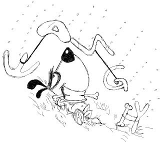
This is a story about a little boy called Tom who's afraid of thunderstorm. After his father told him a story about thunderstorm, he overcomes his fear!
We hope it could somehow, help the kids do not afraid of thunderstorm anymore.
Assignment 6: Gestalt Principles
Assignment 5: Christmas Card
I want to use four representative period of life which are kids, teenagers, getting married and finally happy old couple to present this quote.
It took me forever to draw each picture first, and then arrange them into a card. Coloring is also a painful experience. I chose to color it as brown, sort like old wall. I think it’s the kind of color bring all kinds of memory flash back to people. Also it’s like autumn’s color which represents time for harvest and memory.
I choose a line as “ready for your presents?!!”, actually I was hoping it could be some kind of funny card. I actually trying to say “see! Get so many presents for you!”, but I think the first line is better to put on the card…
Sunday, October 12, 2008
Class Exercises -- Happening and Full & Exclusive
The arrow above tells the lift is going up from level one.
I was trying to draw the glisten on the glass… it’s hard to tell….
Assignment 4 -- Poster Design
I think many people would remember “Dove Evolution”. It is really amazing that by using photoshop anybody can become a “super model”! So I want to learn how to do those PS~~
This is how I came up with the theme “save natural beauty”.
At first I thought drawing would be fun. I will just cartoon character. Then I realize real person would be more suitable for my theme. Then I searched on YouTube to learn those skills and get my friend’s photos to do the poster.

This is the poster I presented in tutorial class.
Actually I don’t like the background. Because the face with makeup took me so much time, I didn’t have time to try different color or effect to see what kinds fit the most.
After tutorial, I get some feedback. First of all, the background is cut into half which was really distracted people’s attention and not well interactive.
And my friend was saying the color is not ok either. Yellow makes Asian (with yellow skin) looks sick.…
So the first change I make was changing the background. I cannot really explain why I choose black yet…
Another thing is our tutor mentioned I should think about whether the original face was necessary. For a poster, usually the less the better…
I kinda like keep the 3 faces… so I haven’t change yet. But I will definitely think about it, might change to less
Wednesday, October 1, 2008
Assigment 3 -- U C What I C
Anyway, about just before I need present my work, I forced myself come out a lousy story...
He seems waiting for somebody there…

Anyway, for the final one, I stick with the original ideal, and I did add in a girl… hope it produce more twist at the end…
Here we go, the story goes like this:
Assigment 2 -- Pictogram for NUS Community
Actually after our lecturer show us all those series of pictograms for each Olympics, off course include 2008 Olympic, I heard people beside me was murmuring the pictogram of this year’s Olympics is the best one! I was quite proud of China~~ hah~~~
Anyway, this assignment I didn’t do well either. I thought we need design a symble or something for NUS Community. So I find these photos I think show the spirit of NUS community. (students get together as teams and friends)


I guess this assignment I get it totally wrong. I suppose to use abstraction which by the way was very fun to abstract stuff! I think I am too perfectionism. Always dislike my own works and try to fig out better one… however… I think my brain is totally empty………
I keep doing the wrong things and I am getting angry about myself… The pictogram above was totally wrong. So I have to do the right thing for the final submission.


I choose the second last one as the final one, because obviously the last one would be too abstract to deliver the information.
Tuesday, September 30, 2008
Assigment 1 -- About Me (I have & I love)
I didn’t get requirement for the first tutorial clearly. So I took my 4 draft for each to class.


For what I love, I was trying to tell I love dogs. So I am feeding the dog and protect him out of the rain, this kinda of thing. We are both happy with smiling faces. Hope it can tell…


After the tutorial, I realize people come out really good ideals and they choose themes like “I have violence”. My works are so childish and worse, I didn’t really understand what I suppose to do. My mushrooms are so “healthy and happy” which cannot tell that I hate them.
Then finally, I was thinking maybe I can draw a mushroom master who’s gonna eat me! It’s like nightmare or something. “After my parents force me to eat mushrooms, I dreamed about they are gonna eat me!” (which is never happened!! Haha~)

 Still think my works are childish. I might change the whole thing if I get time. Anyway, the mushroom needs lots of improvements. I will play with different colors and effects to see what kind fits the best.
I really cannot stand my lousy design. I think I don’t really understand design. When I started my sketches, I was still sort on board, but I lost when I did the final one. I know my name wasn’t really in my design. But I don’t have time to redo already.
At the end of this semester, I know photoshop and illustrator much better than I did at the beginning. So I will fell the first assignment was damn terrible. But I don’t have time to do the whole thing again… I’m blaming my Japanese oral…
Anyway, I did some changes, hope the final one was not worse it has been…


